Your website sucks because your design sucks
Hello and welcome to part three in our five part series on “Why Your Website Sucks”. We’re glad you’re here.
If you are just now joining us, here’s what you missed: We believe that most websites suck because they don’t generate business for the site owner.
In part one we told you why your online strategy sucks. In part two, we told you why your content strategy sucks.
Then you went and fixed all of that!
Now your business and mission strategy is in place, you’re killing it with content that positions you as the clear expert in your space, and your website is generating business by the bushel.
No?
Alright, let’s talk about design. But before we get started, let me issue this disclaimer: Design can be a touchy subject. Aesthetic taste is subjective and nobody wants to be told that their baby is ugly.
I’m not here to fight with anyone about their favorite color. I’m here to help you unsuck your website.
Here’s the deal: the purpose of design is to communicate.
This is why we spent so much time talking about identifying your strategy, crafting the message you are trying to deliver, and understanding the audience who is going to receive it.
Your design doesn’t necessarily suck in a subjective way. Your website may be pretty enough. Your design sucks in an objective way. It’s not communicating the right message and it’s not getting you more business.
Disclaimer: I make no claims of completeness for why your design sucks. It’s a huge topic, so I’ve chosen to focus on the basics.

Your design sucks because your identity sucks
We understand that bootstrapping a new business is hard, especially on a shoestring budget. We understand the temptation to skimp on design. After all, there are so many other expenses to pay that are necessary to actually do business.
So, when it came time to design your identity, you enlisted the help of your artistic cousin. Or you found some dude online offering to whip one up for $20 in 2 hours. Or worse, you wrote your company name in Papyrus and called it a day.
And it sucked. It sucked because it wasn’t clear, distinctive, or memorable. It sucked because it didn’t represent your organization professionally. At its best, it was innocuous, at its worst it actually repelled clients.
If you think good design is expensive, you should look at the cost of bad design.
– Dr. Ralf Speth, CEO Jaguar
Even if you succeed in building a better mousetrap, you aren’t guaranteed success.
A hundred years ago if you had more funding, better machinery, better process, etc., then you could gain a foothold in the market.
But the playing field for most industries has been leveled. The power in the market has been moving into the hands of the consumer. And to the consumer, your first impression is important.
I have no doubt that you have your product or service in place. But your branding is what makes you stand out in a crowded and competitive marketplace.
I’ve already written about the importance of branding, and I don’t want to repeat myself. The crux is that you want your brand to stand out in a positive way, to be consistent across your marketing efforts, and to resonate in the minds of your consumers. You want your branding to build recognition, trust, and loyalty. And that starts with your identity.
If people believe they share values with a company, they will stay loyal to the brand. – Howard Schultz
Consistency is key in branding. Consistency will build trust in the minds of your audience.
A complete identity design will include a branding guide to ensure consistency. This guide will include rules for logo usage, typography, hierarchy, color system, photography, illustration, iconography, and tone of voice. It will shape the look, feel, and voice of your business.
When your brand is the first thing your audience sees and the way they remember you, don’t you owe it to your business to invest in your brand?

Your layout sucks.
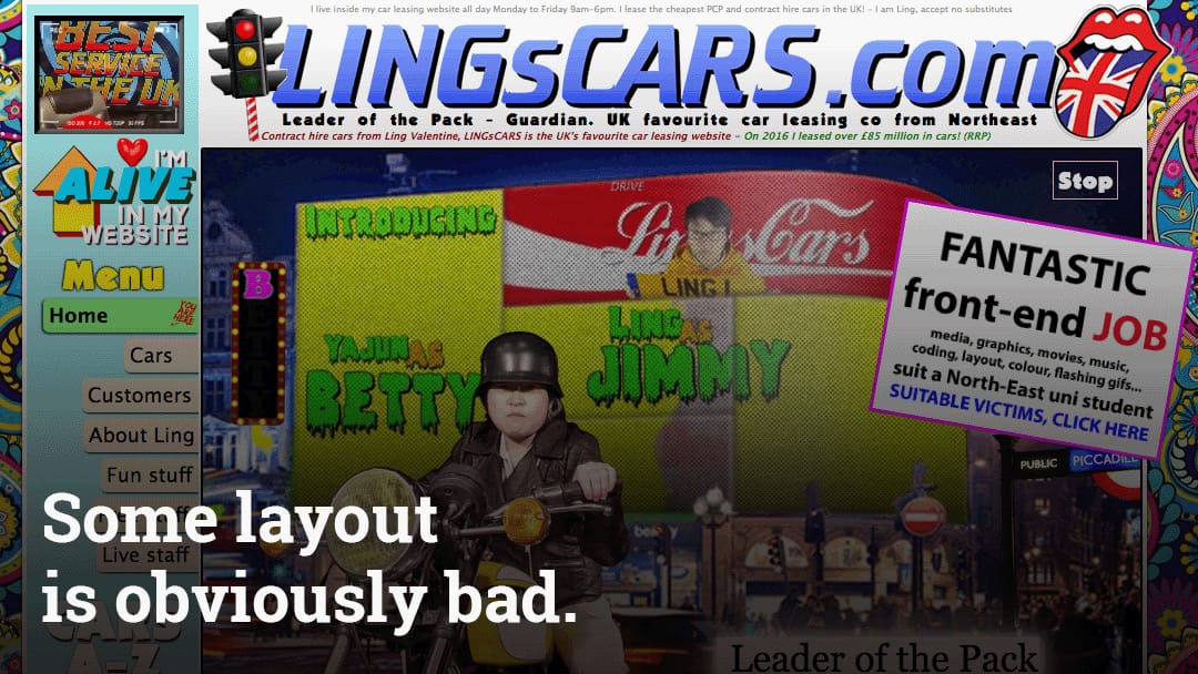
Remember that your design is meant to communicate your message to your audience. The layout of your site should create a visual hierarchy leading them through your message while being visually appealing.
Through the use of whitespace, balance, spacing, proximity, and grouping, your goal is to put your most important content in front of your audience.
Whitespace keeps your design from being cluttered and feeling unorganized and is key to giving your layout a good sense of balance.
Grouping elements can be done in multiple ways, but resist the urge to put elements inside of outlines. Grouping elements through the use of a shared background, color, or location is a stronger cue.
As you go through your content, make a list of all of the elements you want to put on the page. Prioritize those elements by importance. Then use your prioritized list to lay those elements onto the page.

Your photography sucks.
This much is true: visual content drives engagement, and good photography makes a huge difference. To illustrate, let’s look at well-known success story, AirBnB.
When Airbnb began in 2009, they had a rough start. They weren’t getting a lot of traffic and they were getting very few bookings. They knew that something had to change or they would have to close doors.
Co-founder Joe Gebbia noted that the images on the site were trash. So they spent their last few thousand dollars to rent professional cameras and update their listings with consistently beautiful, high-resolution photography.
That made all of the difference. By simply investing in their design and replacing their photographs, they doubled their revenue in the following week.
If your site is marred with photographs taken by a staff member with an iPhone, replace them with professional photography. If you are selling a product, even on eBay, good photography will drive sales.
And for the love of all that is good and holy, if you sell food, hire a professional photographer.
Your color palette sucks.
While we aren’t completely sold on some of the more out-there theories on the psychology of color, we know that your color choices can make or break an otherwise good design.
The study of color theory runs deep, but knowing the basics of the color wheel, grokking color relationships like complimentary and contrasting, understanding hue and saturation, and having an idea of how color can make a design more dynamic or calm will go a long way towards better design.
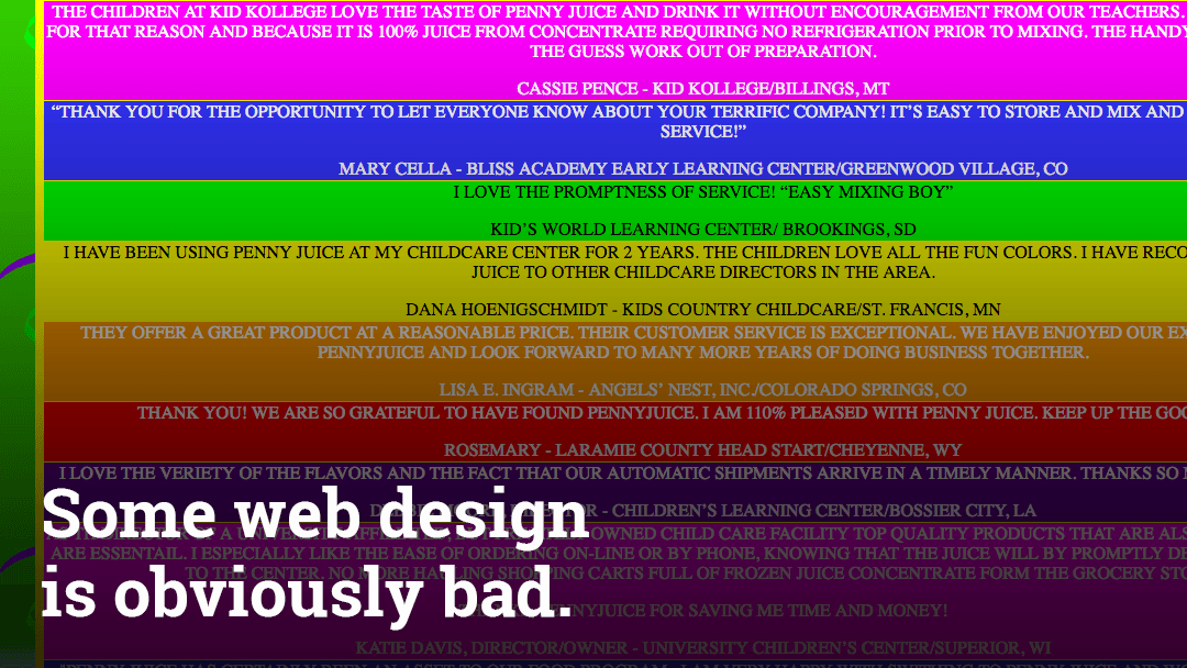
Some color combinations clash and hurt the eyes, some combinations have too little contrast and make your text unreadable, and some combinations will make your charts completely invisible to a percentage of the population.
To keep your site clean, choose a simple palette of two to three colors. Decide on a primary and secondary accent and don’t overuse them. Document them and be sure that you aren’t using 15 shades of the same blue.

Your typography sucks.
Typography is another area of design where the theory is deep but you can get by with a simple understanding.
Just as with colors and so many other areas of design, simplicity and consistency are key when choosing typefaces for your site. A solid typeface for your headlines and a typeface with strong readability are all that most sites really need. Don’t add a third unless you are sure that you have a reason.
When I worked in i.t. I learned, “No one ever got fired for buying Microsoft.” Sticking with the classics is always a good bet.
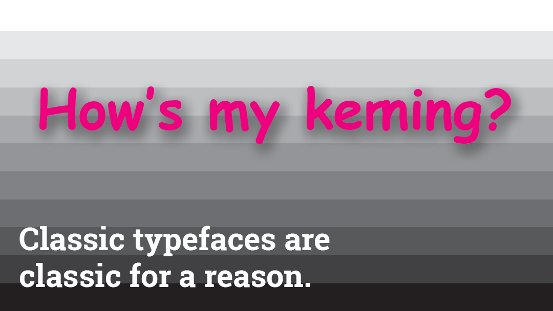
Typefaces like Helvetica, Avenir, Open Sans, Futura, Garamond, Georgia, Minion, etc, have been around for ages because they are good. They are timeless, readable, and likely a perfect choice for your site.
The web is full of large swaths of text, and, as well all know, people don’t read. Which means that it is important for you to create a hierarchy of importance with your choice of typography.
You can create this hierarchy with spacing, size, color, weight contrast, and chunking your content into readable sections. By keeping your paragraphs short, using bulleted lists, and clearly demarking your sections, you will make your content more scannable.
Finally, here are a few rules of thumb: 1) Avoid display fonts; 2) Don’t stretch or compress fonts (this is different than kerning or tracking, which is sometimes acceptable or even necessary); 3) Don’t use justification; and 4) Use real quotation marks.
Your design sucks because et cetera
This post barely scratches the surface of why your design sucks. Graphic design is a craft, and like any craft, it requires years of practice to master.
Your best chance to achieve good design is to hire a professional designer, talk to them about your needs, and make sure that their design is meeting your objectives.
If you are a die-hard DIYer, you’re lucky enough to live in a world where the importance of design is well-acknowledged and there are plenty of resources out there for learning the basics.
Lynda.com has over 700 courses on design, illustration, page layout, painting, drawing, typography, color, and all manner of design software. There are dozens of quality books on graphic design for non-designers. And there are hundreds of websites which curate good design.
To sum up, here are a few things you can do right now to improve the design of your site:
- Get a professionally designed identity that is clear, distinctive, and memorable. Insist on a brand guideline.
- Improve the layout of your site to guide your audience through your content.
- Use better photography.
- Simplify your color palette.
- Pick solid, legible headline and body fonts and trust that the type designers knew what they were doing.
- Keep learning, keep practicing.
As always, we’d love to hear from you, so leave a comment. Next up, we’re going to be writing about why your user experience sucks. Subscribe to be notified. Otherwise, we’ll see you back in a week or so.
Ian Kennedy
Strategist
Ian has worked in design and development for twenty years and has formed strong but loosely-held opinions about both. When he isn’t obsessing and ranting about strategy, design, and development, he’s juggling four kids, teaching programming for a local STEAM school, and working on AthFest 2017. His design skills suck too, but he’s working on it. He likes parties with snacks.